Colors
Use the same palette as your album art, merch, or socials. Consistency across surfaces is how a brand starts to feel like one.
Colors
If you’ve got a palette that runs through your album art, merch, and posters, use it here too. Fans picking up the same colors across every surface is how an artist brand starts to feel cohesive.
Types of colors
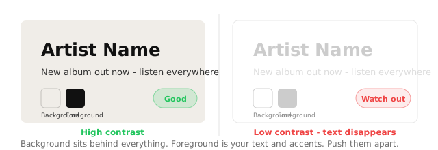
Background
The site-wide color sitting behind everything.
Foreground
Text and accent elements sitting on top.
Watch the contrast between these two. Not enough contrast means text disappears on some screens.
Changing your colors
- Visit Design and select Edit.
- In the Colors section, use the color picker or paste a specific HEX color.
- Publish your design.