Bandweb's design system - named, composable building blocks rooted in the materials of
analog reproduction. Ink, paper, teal spot color, ember warmth.
01 / Color
The Print Shop Palette
Three numbered ramps - bw (neutral), teal, ember - that auto-invert between dark and light
mode. Write bg-bw-50 text-bw-900 once and it works in both themes. Low numbers = surfaces, high numbers = text. Accents mirror
around 500.
Tailwind utilities bg-bw-* / text-teal-* wired to CSS vars
Tier 1 - heroes:hero-brand + dark-island + grain-heavy on gradient-brand with text-hero*. Section CTAs stay flat bg-bw-50 / bg-bw-100.
Brand
gradient-brand
Fixed --g-brand-* stops. Decorative - not text containers.
Surface
gradient-surface-ink / -cool
Neutral washes for alternating sections. Theme-specific recipes.
Brand gradients
gradient-brand
gradient-brand-subtle
Surface gradients
Neutral
surface-ink
Cool
surface-cool
Gradient conventions:Heroes = Tier 1 brand gradient (hero-brand + grain-heavy). Section CTAs use
flat bg-bw-50 / bg-bw-100. Use surface gradients (ink, cool) for alternating
sections. grain-subtle on cards and
section backgrounds.
02 / Texture
The Copy Room
Grain and glass - layerable textures that make surfaces feel physical.
Grain levels
grain-subtle (0.06)
grain-medium (0.10)
grain-heavy (0.16)
grain-coarse (0.20)
Glass treatments
glass-subtle
blur 8px
glass-medium
blur 16px
glass-heavy
blur 24px
03 / Shape
The Cut
Soft rounding is the default - warm and approachable. Sharp edges are intentional. Pills are
for CTAs.
Edge treatments
cut-sharp
cut-soft
cut-round
cut-pill
cut-circle
Dividers
RULE-SOLID
RULE-GRADIENT
04 / Shadow
The Stack
Analog-inspired elevation. Hard offsets, stacked paper, warm diffusion - not generic CSS
box-shadows.
shadow-print
Hard offset shadow
Subtle misregistered print. 2px 2px, never distracting.
shadow-paper
Soft paper shadow
Warm, diffuse. Floating UI, modals.
shadow-stack
Stacked paper
Subtle layered offset. Supports content, never distracts.
05 / Border
The Frame
Stroke weights, subtle framing classes, and form-field border conventions. Active form
fields always get a full-opacity 1px border with rounded corners.
Stroke weight tokens
stroke-hair (0.5px)
stroke-thin (1px)
stroke-medium (2px)
stroke-bold (3px)
stroke-heavy (5px)
Subtle framing classes - opacity ramp for containers
frame-whisper (6%)
Barely visible
Glass panels, dark-on-dark edges
frame-hint (12%)
Subtle separator
Card groups, sidebar edges
frame-soft (20%)
Visible but gentle
Resting form inputs, dropdowns
frame-teal-glow
Teal accent
Active/selected state
frame-ember-glow
Ember accent
Warning containers
Form field conventions - benchmarked from app_bandweb_io
1px solid ember + 1px ring ember · label ember · rounded
Convention: Active form fields use a full-opacity
1px teal border + 1px teal ring (2px total visual weight). The field label turns teal on focus.
Resting fields use reduced-opacity borders (ink-fade). Corners are always rounded.
06 / Motion
The Machinery
Named enter transitions and hover responses. Click "Replay" to trigger each animation.
Enter transitions
enter-fade
Fade In
enter-rise
Rise Up
enter-stamp
Stamp!
enter-flicker
Flicker
Staggered children
01
0ms delay
02
80ms delay
03
160ms delay
04
240ms delay
Hover treatments (interact with these)
hover-lift
Rises + print shadow
hover-tape
Slight rotation + shadow
07 / Image
Duotone & Overlay
Image processing treatments - duotone color mapping, overlays, and masks. Using a generated
SVG placeholder.
Original
duotone-brand (ink → teal)
duotone-warm (ember → paper)
duotone-contrast (ink → ember)
Overlay system
overlay-ink
Dark gradient, text-safe zone
overlay-gradient
Brand-colored, vibrant
08 / Type
Typography in Context
The existing type system - Plus Jakarta Sans + JetBrains Mono - shown with the new color
tokens and emphasis tiers.
Section Label / Mono 500
Display Heading at Weight 800
Subheading at Weight 600 / Medium Emphasis
Body text at normal weight. This uses the low emphasis tier - ink-ghost on dark backgrounds. Long enough to show line-height and measure. Aim for 60-75 characters
per line.
Connect your platforms once. Your site updates itself. Every show, every release, every
link - always current.
Sign up · 30-day free trial
10 / Identity
The Mark
Five geometric elements, precisely measured. The logo's shapes echo throughout the system -
circles, slashes, angular-beside-curved tension - creating brand recognition without
repetition.
Logo mark - color contexts
On Ink
On Paper
On Teal
Ember Variant
Logo anatomy - five elements
B Form
Angular
Circles
r=10 + r=13.3
Slashes ×2
13° from vertical
Dot
r=10 (bookend)
Five extracted motifs - ink / paper / newsprint palette only
Circle Pair
3:4 ratio, bottom-aligned r=10 / r=13.3
13° Slash
Flat top + bottom Rect TL/BR, Curve TR/BL
Bookend
Same-size dots flanking content
Vert Stack
Small above large lean-in to text
Sympathetic
Rect softens toward adjacent curve
Motifs in practice - subtle, auxiliary accents
Featured Release
New Album Out Now
Slash pair - ink-ghost + ink-fade at 13°
Now Playing
Bookend Dots
Subtle dots flanking a label - dots in ink-ghost, text stays teal
bookend-dots utility - dots inherit color, content is independent
Stacked Pair (left of text)
Right-justified dots lean into the text. Max height ≤ text row.
circle-pair-v (default lean-in) + accent-dot-sm / lg
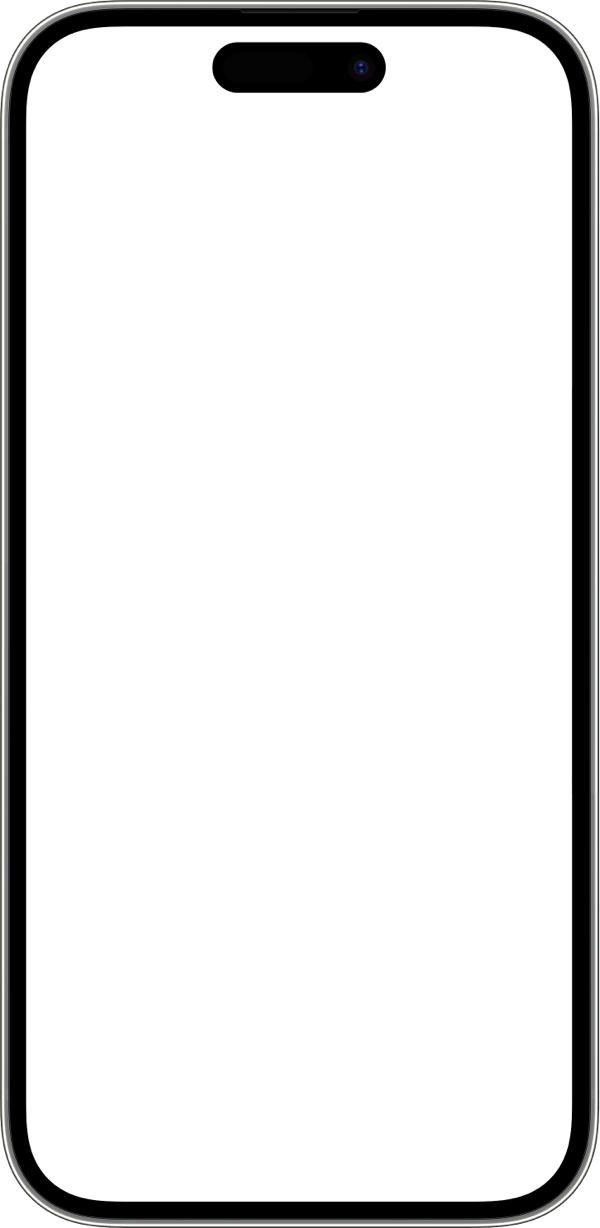
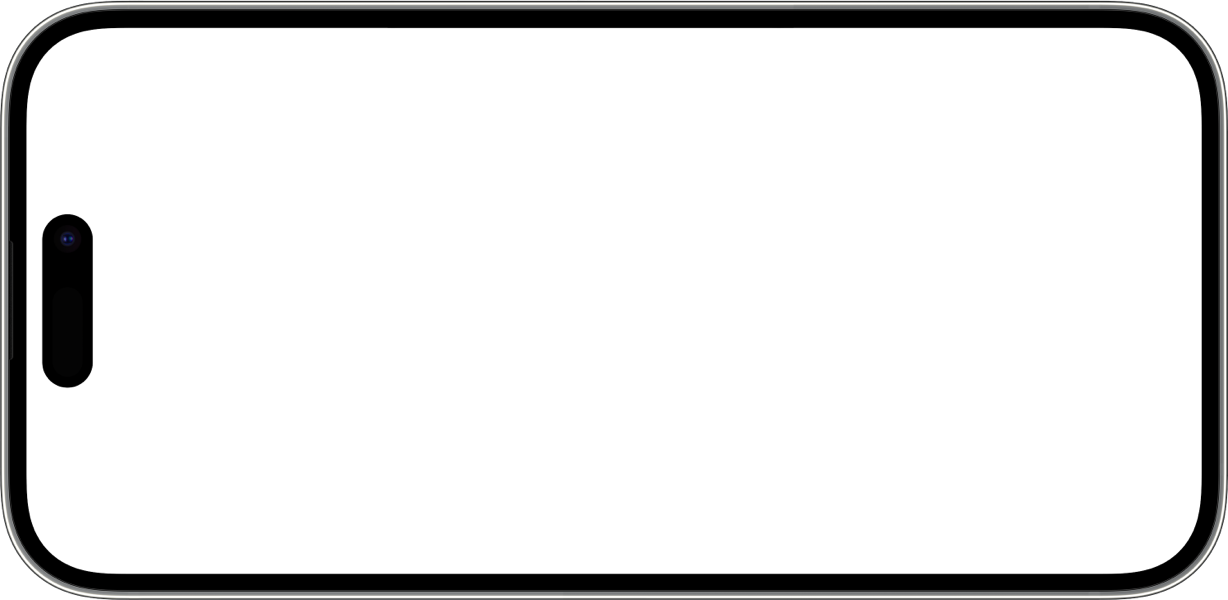
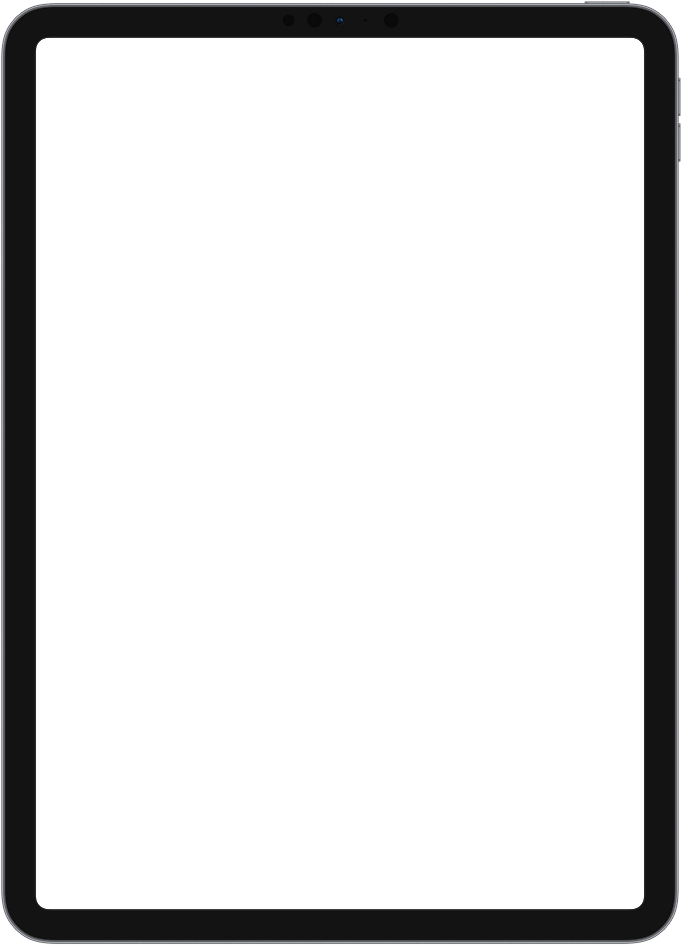
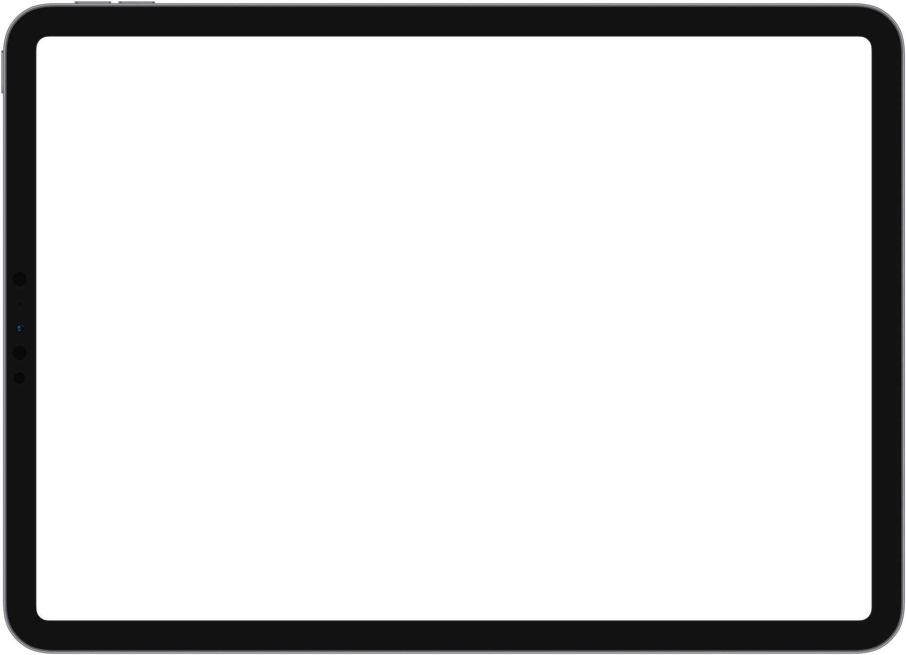
Device frames for showcasing artist sites. Screenshot sits behind a transparent-bezel PNG
overlay. Four orientations available, plus tilt and shadow utilities for composed layouts.
Phone - portrait & landscape
Artist Site
390 × 844
device--phone-v (300px default)
Artist Site
844 × 390
device--phone-h (400px default)
Tablet - portrait & landscape
Artist Site
820 × 1180
device--tablet-v (340px default)
Artist Site
1180 × 820
device--tablet-h (480px default)
Usage: Place a screenshot or div as .device__screen, then the frame PNG as .device__frame. The screen is absolutely positioned behind the frame. Set container width to resize
(default widths are starting points). Use object-fit: cover for screenshot images.
Tilt & Composition
Devices tilted and layered against section backgrounds. Tilt angles are derived from the
logo's 13° slash - quarter (3°), half (6°), and full (13°). Pair with .device-shadow for lifted depth.
Tilt utilities
3°
device-tilt-1
6°
device-tilt-2
13°
device-tilt-3
+3°
device-tilt-r1
+6°
device-tilt-r2
Composition A - Phone fan (bg-bw-50)
Home
page 1
Music
page 2
Tour
page 3
Composition B - Single tablet feature (bg-bw-100)
Tour Dates
full-width feature
Composition C - Single phone on paper substrate
Info Page
phone portrait
Composition rules: Never mix phone and tablet in
the same section - their relative scale is off-putting. Tablets are single large features, one
per section; use phones when showing several screens together. Fan same-type devices in opposing
directions for editorial spread. Prefer quarter-tilt (device-tilt-1, 3°) for subtle organic feel; half-tilt (6°) for emphasis; full 13° sparingly. Always pair
tilt with device-shadow - without it,
tilted devices look stuck rather than lifted.
13 / Photo Treatments
The Darkroom
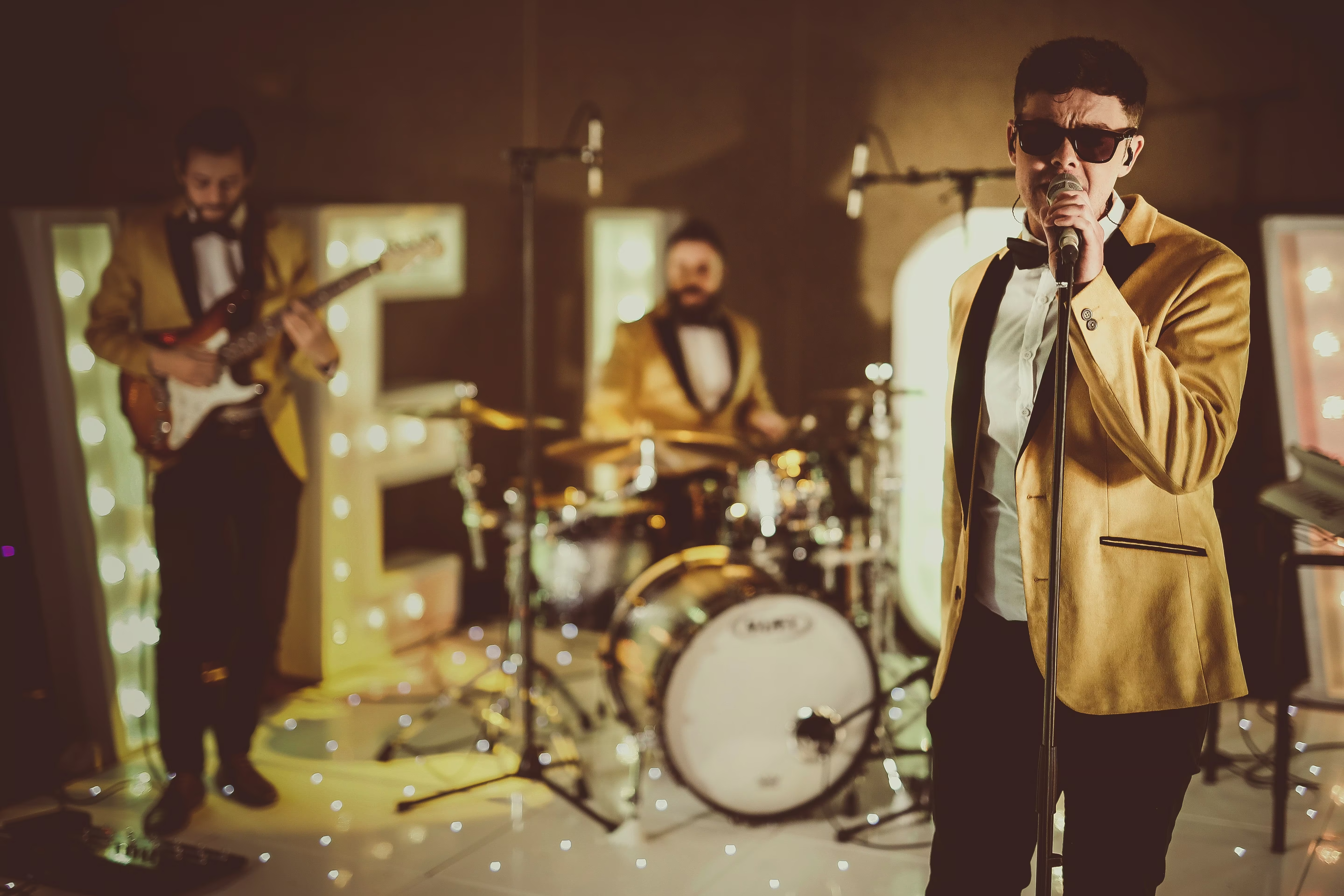
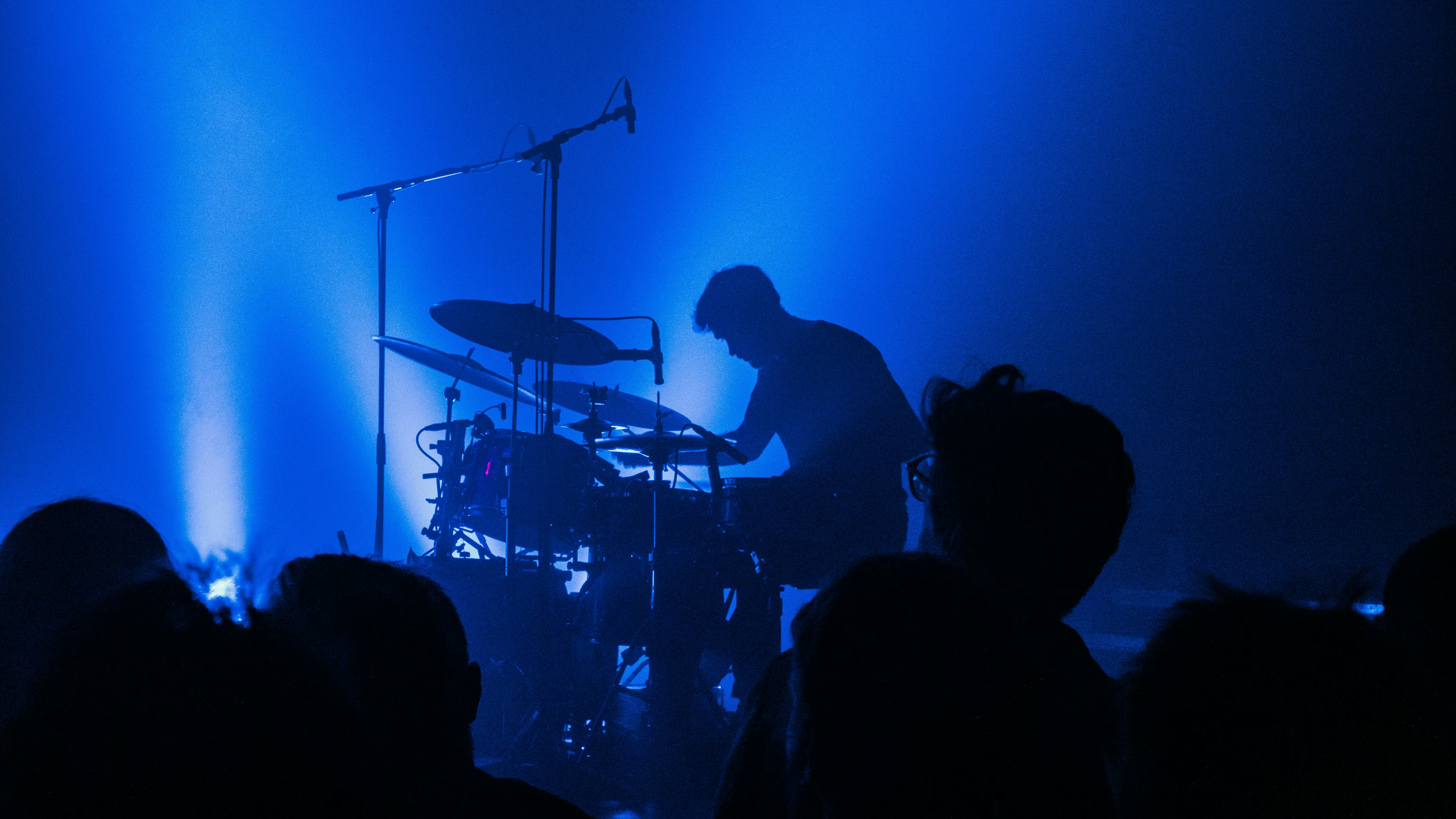
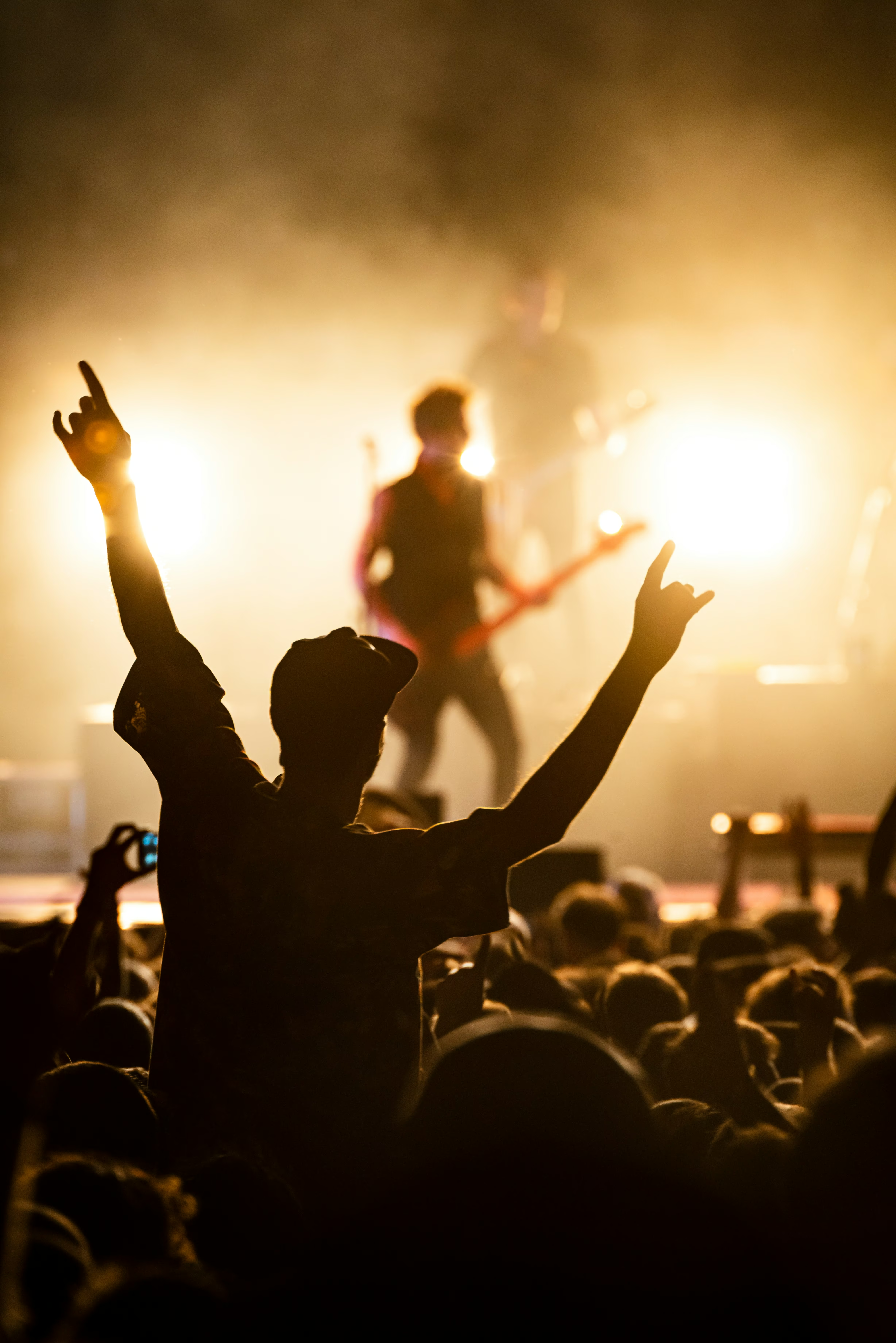
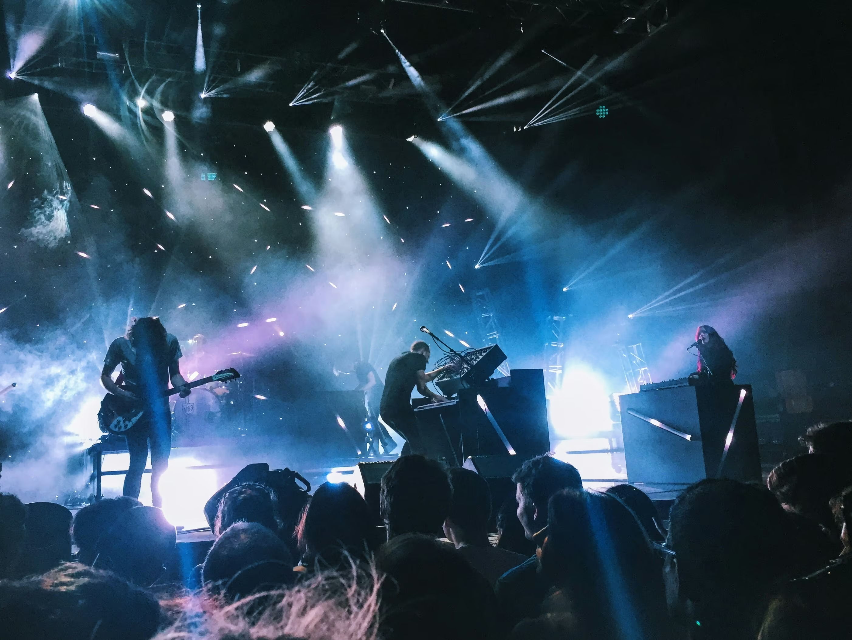
Musician photos as section backgrounds, color-graded to the Bandweb palette. Three-layer
stack: grade (color shift) → scrim (darkness) → texture (grain). Every photo should feel
like it came off the same print run.
Duotone remap + heavy scrim + grain. The photo stays vivid but type stays readable at the
bottom edge.
photo-grade-contrast + photo-scrim-vignette
Raw & Unfiltered
High contrast crushes to pure black and white. Vignette draws focus inward. No grain
needed - the contrast treatment IS the texture.
Photo treatment rules:
Never use a raw, ungraded photo - every image gets at least a grade class. Match the grade to
the photo's natural lighting: warm shots → photo-grade-ember, cool shots → photo-grade-teal,
uncertain → photo-grade-ink (always
safe). Any section with text over a photo needs a scrim - photo-scrim-gradient is the default; reach for photo-scrim-heavy when you need body text legibility. Use photo-grain to tie graded photos into the print-shop texture system. Duotone grades are the strongest treatment
- they fully remap color to two brand tones, making any photo feel like risograph output.